

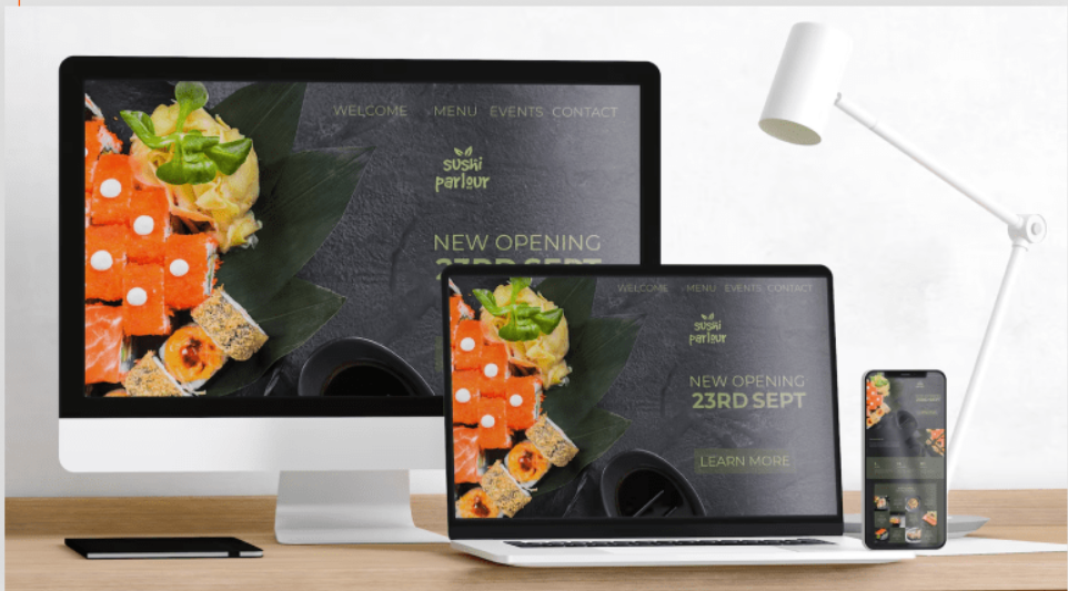
Websites are no longer viewed on a single screen. Users move between mobile phones, tablets, laptops, and large displays throughout the day. This shift has changed how businesses must think about their online presence. Responsive Web Design Services help brands create websites that adapt smoothly across devices without sacrificing clarity, usability, or trust.
For modern businesses, responsive design is not a trend; it is a necessity. It has become a core requirement for visibility, engagement, and long-term growth across websites, apps, and even social media.
What Responsive Web Design Really Means Today
Responsive design means more than shrinking a layout to fit a screen. It focuses on structure, readability, interaction flow, and performance across devices. A responsive website adjusts layout, images, navigation, and content hierarchy based on screen size and user behavior.
From real project experience, one thing is clear:
Users do not tolerate broken layouts, tiny text, or slow-loading pages, especially on mobile.
Users do not tolerate broken layouts, tiny text, or slow-loading pages, especially on mobile.
Responsive design solves these problems at the foundation level instead of fixing them later.
Why Modern Businesses Depend on Responsive Experiences
User expectations have changed. People expect websites to work naturally on any screen without extra effort. When a site fails to adapt, users leave quickly.
Here are facts that consistently shape business decisions:
- Over 60% of web traffic comes from mobile devices.
- Mobile users abandon pages that take more than 3 seconds to load
- Google prioritizes mobile-friendly websites in rankings.
- Poor mobile experience directly reduces conversions.
Businesses that ignore responsiveness lose visibility and credibility simultaneously.
Responsive Web Design Services and Brand Trust
Trust starts with comfort. When users land on a website that feels easy to use, they feel confident in the brand behind it.
Responsive experiences build trust by:
- Displaying content clearly on all screens
- Maintaining a consistent brand identity
- Reducing navigation confusion
- Supporting touch-friendly interactions
In service-based businesses, this trust often decides whether a visitor contacts the company or leaves.
Core Elements of Effective Responsive Design
Successful responsive design combines technical planning with user understanding.
Flexible Layout Structure
Layouts must adapt without breaking. Designers use flexible grids that adjust naturally across screen sizes.
This approach prevents:
- Overlapping elements
- Horizontal scrolling
- Hidden content
Users should never struggle to find information because of screen limitations.
Scalable Typography and Readability
Text readability changes across devices. Responsive typography ensures text remains legible without zooming.
Good practices include:
- Adjustable font sizes
- Balanced line spacing
- Clear heading hierarchy
Readable content keeps users engaged longer and reduces bounce rates.
Optimized Media Handling
Images and videos must resize without slowing the site. Heavy media files hurt performance on mobile networks.
Responsive media strategies include:
- Adaptive image loading
- Compression without visual loss
- Device-specific resolutions
Fast visuals improve user satisfaction immediately.
How Responsive Web Design Services Improve Business Outcomes
Below is a pattern-shifted table showing real business impact.
| Higher engagement | Users stay longer across devices |
| Better SEO | Mobile-friendly structure supports rankings |
| Increased conversions | Clear CTAs work on all screens |
| Reduced maintenance | One website instead of multiple versions |
This approach saves time, budget, and technical complexity.
Responsive Design and Social Media Traffic
A large portion of website visitors comes from social platforms. These users almost always arrive via mobile devices.
If landing pages are not responsive:
- Content appears broken
- Buttons are hard to tap
- Forms feel frustrating
Responsive design ensures social traffic converts rather than bounces.
Experience-Based Insight from Real Projects
In client projects across different industries, one trend appears repeatedly:
Responsive improvements often increase conversions without changing content.
Responsive improvements often increase conversions without changing content.
Simple adjustments like:
- Better spacing
- Touch-friendly buttons
- Clear navigation
can significantly improve results. Users respond positively when experiences feel effortless.
Common Responsive Design Mistakes Businesses Make
Many businesses believe they have responsive websites, yet issues persist.
Common problems include:
- Mobile layouts copied directly from desktop.
- Hidden content that users never find
- Overloaded menus on small screens
- Ignoring landscape orientation
True responsiveness requires testing across real devices, not assumptions.
Responsive Web Design Services vs Separate Mobile Sites
Some businesses still consider separate mobile websites. This approach often creates more problems than solutions.
Responsive design offers:
- Unified content management
- Consistent branding
- Easier SEO optimization
- Lower long-term cost
Managing one adaptive website is more effective than maintaining multiple versions.
Accessibility and Responsive Design Go Together
Accessibility improves when responsive principles are applied correctly.
Responsive websites support:
- Screen readers
- Keyboard navigation
- Adjustable text sizes
- Reduced motion preferences
Accessible design benefits everyone, not only users with disabilities.
Responsive Design and Conversion Optimization
Conversions depend on clarity and ease. Responsive layouts ensure call-to-action elements remain visible and usable across devices.
Key conversion benefits:
- Buttons stay reachable
- Forms adapt to screen size.
- Checkout flows remain smooth.
When users feel in control, they act with confidence.
Choosing the Right Responsive Web Design Services
Businesses should look beyond visuals when choosing a service provider.
Important evaluation points:
- Experience across industries
- Strong UX understanding
- Performance optimization skills
- Mobile-first approach
- Ongoing support capability
A responsive website is a long-term asset, not a one-time project.
The Future of Responsive Experiences
As new screen sizes emerge, responsive thinking will continue evolving. Foldable devices, large displays, and wearable integrations already influence design decisions.
Businesses that invest early in adaptive frameworks remain prepared for future changes without constant redesigns.
FAQs
What are Responsive Web Design Services?
They involve creating websites that adapt seamlessly to different screen sizes and devices.
Do responsive websites help SEO?
Yes. Search engines favor mobile-friendly and fast-loading websites.
Is responsive design suitable for small businesses?
Absolutely. It helps small brands compete with larger companies online.
How long does responsive design implementation take?
Timelines vary, but planning and testing are more important than speed.
Can existing websites be converted to responsive?
Yes, with proper redesign and technical adjustments.
 Turkish